Tobbe
October 5, 2020, 9:28am
1
Discussed this on Discord, but wanted to put it here as well so people can find it when searching in the future
import Earth from './earth.svg';

<Earth />
Just import your svg file and svg-react-loader will make a react component out of it that you can use in your jsx
2 Likes
One other way I have been doing this is to have icon components in web/components/icons
This is a `chevron-double-right’ pointing to the right from HeroIcons
export const LastArrowIcon = ({ fill = 'currentColor' }) => {
  return (
    <svg className="w-5 h-5" fill={fill} viewBox="0 0 20 20">
      <path
        fillRule="evenodd"
        d="M10.293 15.707a1 1 0 010-1.414L14.586 10l-4.293-4.293a1 1 0 111.414-1.414l5 5a1 1 0 010 1.414l-5 5a1 1 0 01-1.414 0z"
        clipRule="evenodd"
      ></path>
      <path
        fillRule="evenodd"
        d="M4.293 15.707a1 1 0 010-1.414L8.586 10 4.293 5.707a1 1 0 011.414-1.414l5 5a1 1 0 010 1.414l-5 5a1 1 0 01-1.414 0z"
        clipRule="evenodd"
      ></path>
    </svg>
  )
}
That way I can use the default currentColor or set the fill color (or other attributes) I want and just have one reusable component (since your svg content will be bundled).
The I can use it:
const LastLink = ({ paginatedRoute, _offset, total, limit }) => {
  let page = totalPages({ total, limit })

  return (
    <Link
      to={paginatedRoute({ page })}
      className="-ml-px relative inline-flex items-center px-2 py-2 rounded-r-md border border-gray-300 bg-white text-sm leading-5 font-medium text-gray-500 hover:text-gray-400 focus:z-10 focus:outline-none focus:border-blue-300 focus:shadow-outline-blue active:bg-gray-100 active:text-gray-500 transition ease-in-out duration-150"
      aria-label="Last"
    >
      <LastArrowIcon />
    </Link>
  )
}
Now if for some reason I need to change the width and height I can have some properties and modify to take a size (since the icon should be square):
export const LastArrowIcon = ({ fill = 'currentColor', size = 5 }) => {
  return (
    <svg className={`w-${size} h-${size}`} fill={fill} viewBox="0 0 20 20">
      <path
        fillRule="evenodd"
        d="M10.293 15.707a1 1 0 010-1.414L14.586 10l-4.293-4.293a1 1 0 111.414-1.414l5 5a1 1 0 010 1.414l-5 5a1 1 0 01-1.414 0z"
        clipRule="evenodd"
      ></path>
      <path
        fillRule="evenodd"
        d="M4.293 15.707a1 1 0 010-1.414L8.586 10 4.293 5.707a1 1 0 011.414-1.414l5 5a1 1 0 010 1.414l-5 5a1 1 0 01-1.414 0z"
        clipRule="evenodd"
      ></path>
    </svg>
  )
}
and if I want a big green arrow:
<LastArrowIcon color="green" size={20} />
1 Like
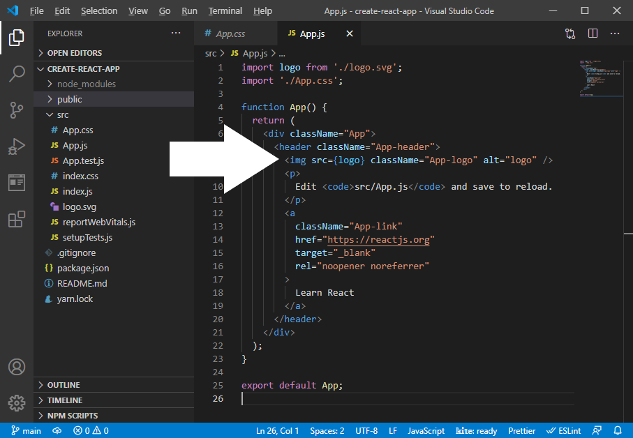
Is there a way to import the SVG and pass it to the HTML img src like in Create React App? The reason is that some SVG contains non-react attribute, and React will display a warning in the browser console.
@andrew-hh Have you tried svg to react converters like
or
It will clean the SVG and component-ize.
4 Likes

